

Input
Props
| Prop Name | Type | Required | Default | Description |
|---|---|---|---|---|
| icon | string | ReactNode | @deprecated 使用 suffix 替换
图标,传入 string 时为图标类型,也可直接传入图标组件 | ||
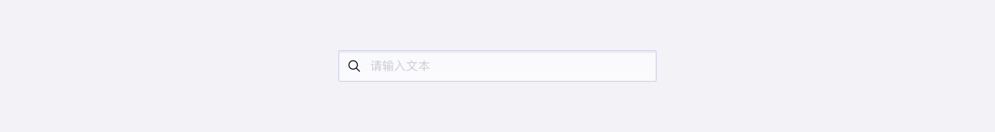
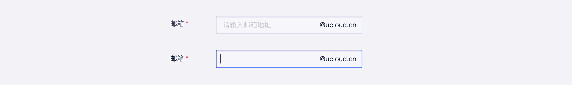
| prefix | ReactNode | 前缀 | ||
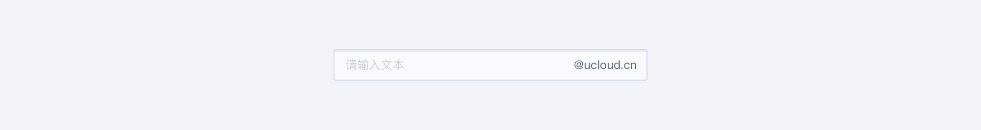
| suffix | ReactNode | 后缀 | ||
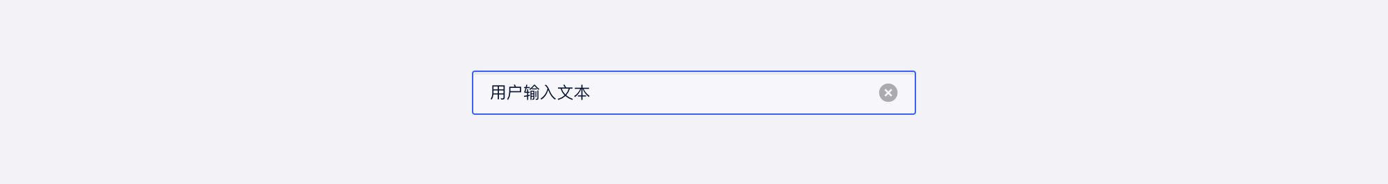
| clearable | boolean | { autoFocus?: boolean; callOnChange?: boolean } | 是否可清空 | ||
| size | Size | 'md' | 尺寸 | |
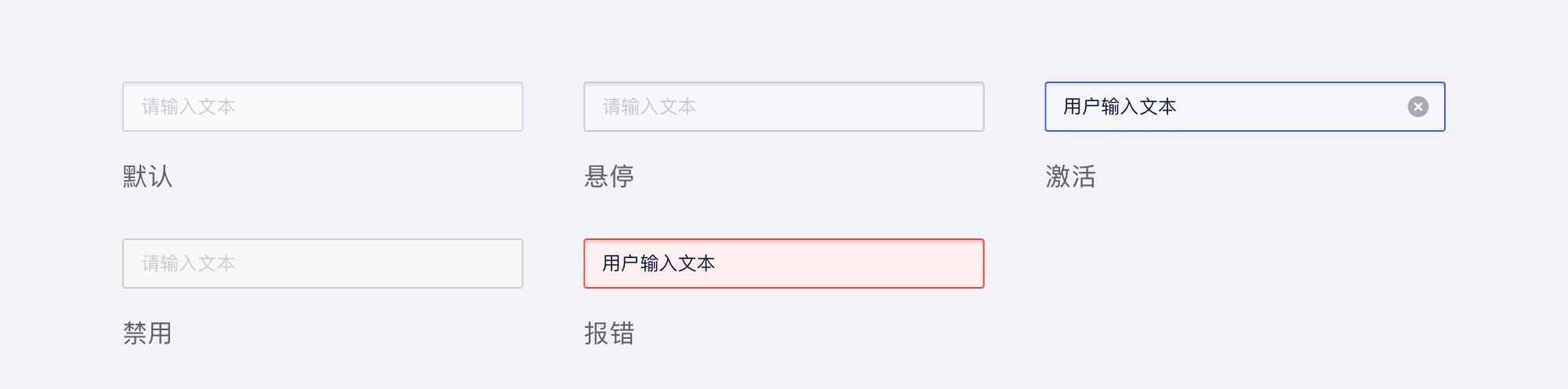
| status | 'default' | 'error' | string | 状态 | ||
| block | boolean | 展示变更为块占位 | ||
| onClear | () => void | noop | 点击 clear 按钮回调 | |
| customStyle | { border?: string; boxShadow?: string; background?: string; } | 自定义样式 |
说明
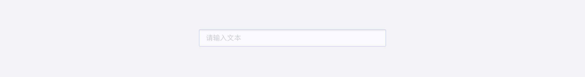
- 这是 Input 组件,在原生 input 上进行扩展,支持自定义前后缀
- 需要数字输入框的请使用
Input.Number,具体文档请参见 NumberInput 组件 - 需要 Textarea 的请使用
Input.Textarea,具体文档请参见 Textarea 组件
演示
演示
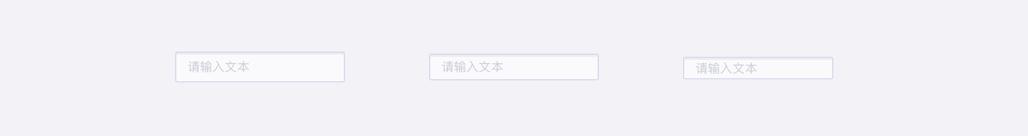
size - 尺寸
prefix - 前缀
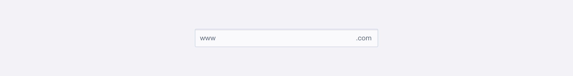
suffix - 后缀
disabled - 禁用
clearable - 可清空
status - 状态
测试
Search
Props
| Prop Name | Type | Required | Default | Description |
|---|---|---|---|---|
| onSearch | (value: string) => void | 搜索回调,回车/点击搜索按钮触发 |
说明
- 这是 Search 组件,用于搜索,支持除了 suffix 以外的所有 Input 的 props
- 在点击搜索按钮或者回车时会触发搜索事件