


Radio
Props
| Prop Name | Type | Required | Default | Description |
|---|---|---|---|---|
| checked | bool | 是否选中 | ||
| defaultChecked | bool | 默认是否选中 | ||
| disabled | bool | 是否禁用 | ||
| onChange | func | () => {} | 点选时的回调 | |
| value | any | radio的值 | ||
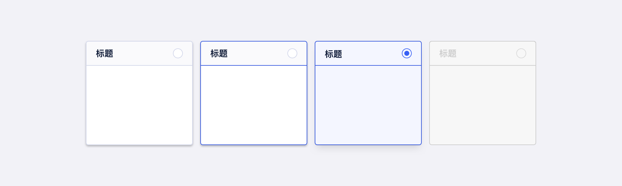
| styleType | enum | 样式风格 | ||
| size | enum | 尺寸,styleType 为 card、list 时无效 | ||
| title | node | 标题,styleType 为 card 时使用 | ||
| extra | node | 附加内容,styleType 为 list 时使用 |
说明
Radio 单选框组件,提供多张单选框样式
演示
演示
checked - 选中
disabled - 禁用
Radio styleType 为 button 且 disabled 时,如需展示 Tooltip 等,请参考 Button 的 fakeDisabled。
size - 大小
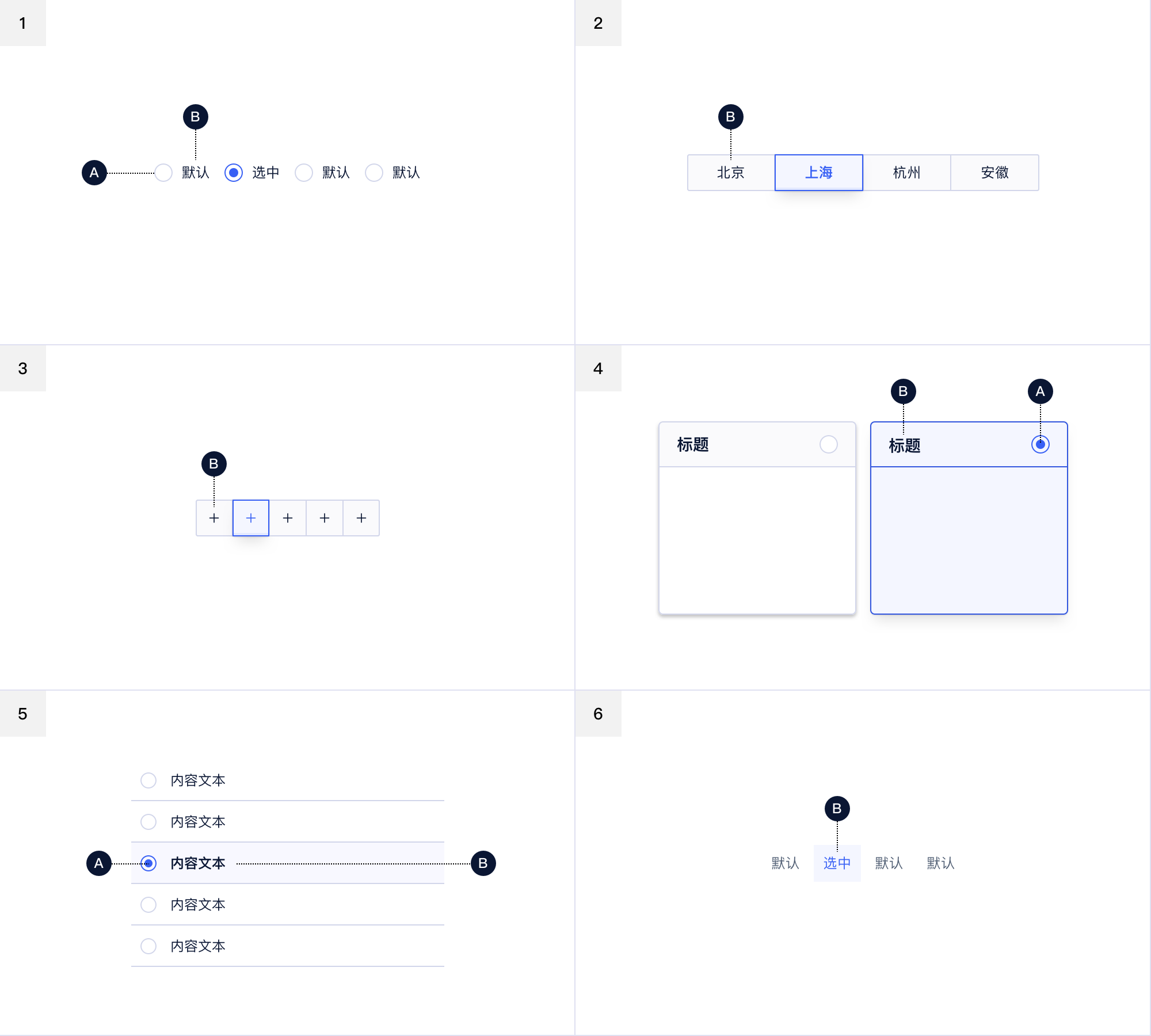
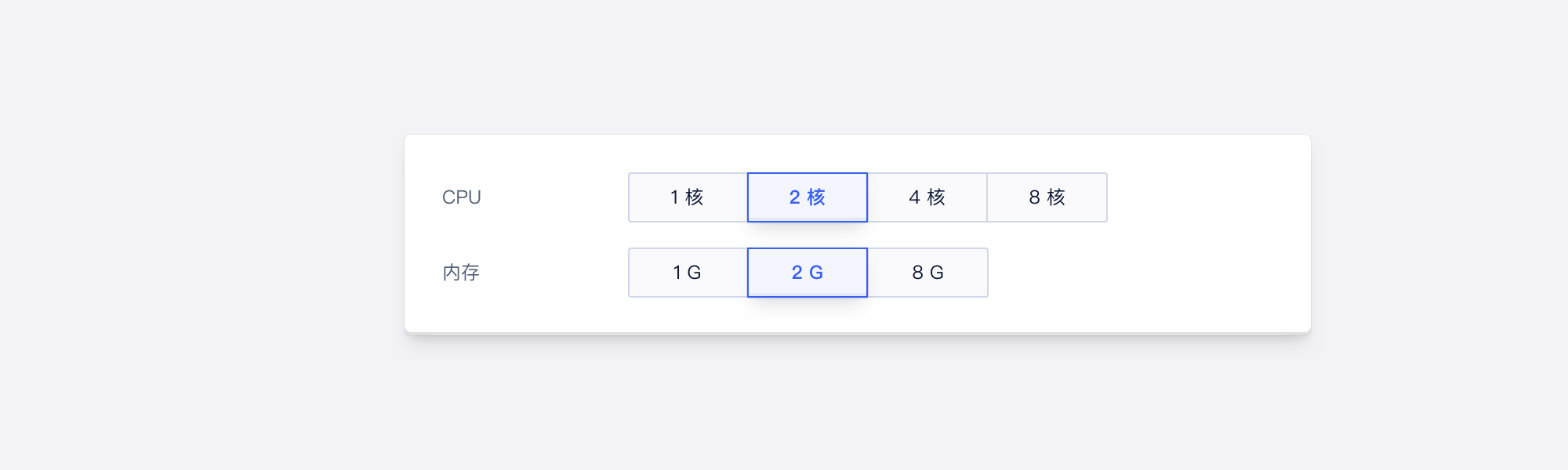
styleType - 样式类型
defaultValue - 默认值,非受控
Group
Props
| Prop Name | Type | Required | Default | Description |
|---|---|---|---|---|
| value | any | 当前值,controlled | ||
| defaultValue | any | 默认值,uncontrolled | ||
| onChange | func | () => {} | 修改时的回调 | |
| options | array | 快速选项 | ||
| disabled | bool | 禁用 | ||
| size | enum | 尺寸 | ||
| styleType | enum | 样式风格 |
说明
这是 Radio.Group - 单选框组组件,用于包裹 Radio 组件并获取数据变化,也可以直接使用 options 来定义选项