
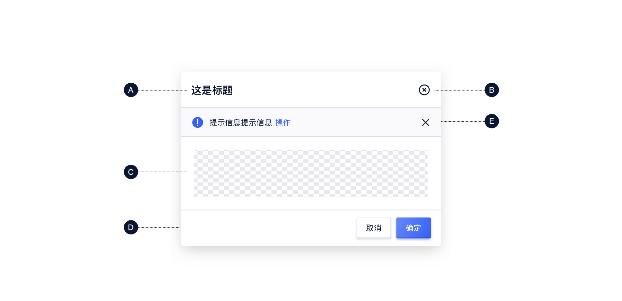
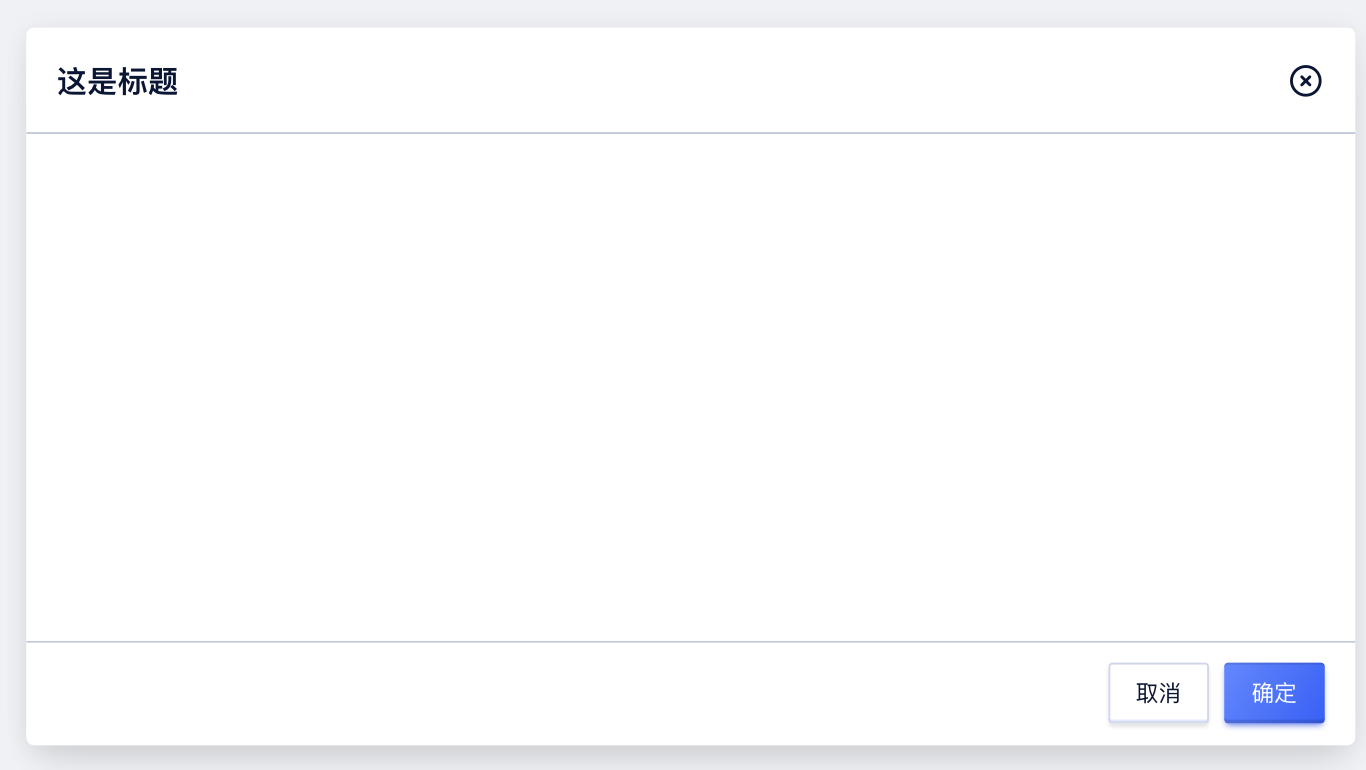


Modal
Props
| Prop Name | Type | Required | Default | Description |
|---|---|---|---|---|
| title | node | 头部内容 | ||
| footer | union | 底部内容 | ||
| visible | bool | 显示与否 | ||
| size | enum | 'md' | 弹窗尺寸 | |
| zIndex | number | 1010 | 弹窗的z-index | |
| closable | bool | true | 是否有关闭按钮 | |
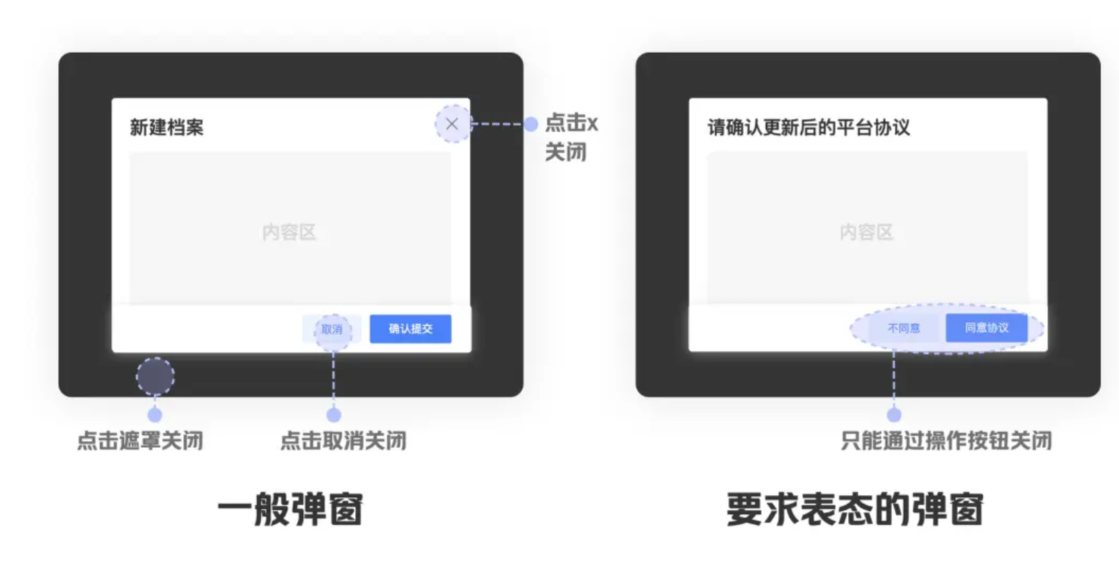
| mask | bool | true | 是否有遮罩 | |
| maskClosable | bool | 是否可以点击遮罩关闭 | ||
| keyboard | bool | 是否可以esc关闭 | ||
| onClose | func | 点击关闭按钮、默认取消按钮、遮罩进行关闭时的回调 | ||
| onOk | func | 点击默认的确认按钮时的回调 | ||
| okButtonProps | object | 默认展示的确定按钮的自定义 props | ||
| cancelButtonProps | object | 默认展示的取消按钮的自定义 props | ||
| afterClose | func | 关闭后的回调 | ||
| destroyOnClose | bool | 关闭后是否自动销毁 | ||
| maskAnimation | string | 'fade' | 遮罩层的动画 | |
| animation | string | 'fade' | 弹窗的动画 | |
| className | string | 弹窗部分的类名 | ||
| wrapClassName | string | 弹窗包裹容器的类名 | ||
| customStyle | shape | 自定义预设部分样式 | ||
| style | object | 弹窗的样式 | ||
| bodyStyle | object | 弹窗的内容部分的样式 | ||
| maskStyle | object | 遮罩层的样式 | ||
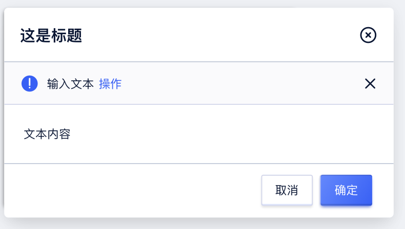
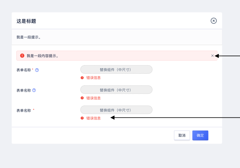
| notice | union | 传入 node 显示提示框或使用 Notice 组件的 props 来自定义提示 |
说明
- 弹窗组件,纯受控组件,显示隐藏通过 visible 控制
- 提供 jsx 使用和命令式调用
- 如果想要命令式调用需要注意确保理解命令式调用的风险再去使用
关于命令式调用弹窗的风险告知
命令式调用弹窗虽然看似简单易用但却存在一些不可避免的风险,而且不易追踪和排查。
实现:命令式主要调用通过创建一个单独的 React 渲染实例来实现,所以存在以下已知问题(是否存在其它风险还不知道):
- 会导致上下文丢失
由于和主实例无关联,会导致 Context 无法获取等各种问题,组件只能解决一些全局的 Context 的处理(并且伴随着一定风险,页面存在多实例可能会出现错乱的情况),而其它项目中的 Context 都会丢失,需要调用者自己处理使用 Context 包裹弹窗等。
并且这种问题不易排查,风险极大。 - 生命周期脱离
同样由于命令式调用,会导致 Modal 的生命周期脱离,在对应页面生命周期变动时无法同步到,需要自行处理销毁、更新等操作。否则会出现如未关闭弹窗时切换页面,弹窗依旧存在等问题。
同样这种问题不易排查,风险极大。
替换方案:
通过声明式弹窗可以非常简单的替换掉命令式弹窗,可以看到代码量没有任何的增加,但是却可以规避上述的问题,并且下述的命令弹窗还没处理声明周期的问题,卸载时没有销毁弹窗(可点开弹窗点浏览器后退对比试试),如果加上常规处理,命令式的代码量会更多且风险更高:
class DetailModal extends React.Component {
    render() {
        return (
            <Modal
                visible
                footer={
                    <div>
                        <Button styleType="primary" onClick={this.props.onClose}>
                            确定
                        </Button>
                    </div>
                }
                onClose={this.props.onClose}
            >
                <Modal.Content>This is the detail for {this.props.detail.title}</Modal.Content>
            </Modal>
        );
    }
}
DetailModal.propTypes = {
    onClose: PropTypes.func.isRequired,
    detail: PropTypes.object.isRequired
};

const dataSource = new Array(100).fill(null).map((item, i) => ({
    key: i,
    title: `item ${i}`
}));
const columns = [
    {
        title: 'title',
        key: 'title',
        dataIndex: 'title'
    }
];

class IDemo extends React.Component {
    constructor(props) {
        super(props);
        this.state = {};
        this.columns = [
            ...columns,
            {
                title: 'action',
                key: 'action',
                render: item => {
                    return <ActionList actionList={[{ label: 'detail', onClick: () => this.showDetail(item) }]} />;
                }
            }
        ];
    }
    showDetail(item) {
        this.modal = Modal.openModal(<DetailModal detail={item} onClose={() => this.closeDetail()} />);
    }
    closeDetail() {
        this.modal.destroy();
    }
    onEnd(result) {
        if (!this.modal) return;
        console.log(result);
        this.modal.destroy();
    }
    render() {
        return (
            <div>
                <Table dataSource={dataSource} columns={this.columns} />
            </div>
        );
    }
}

class SDemo extends React.Component {
    constructor(props) {
        super(props);
        this.state = {};
        this.columns = [
            ...columns,
            {
                title: 'action',
                key: 'action',
                render: item => {
                    return <ActionList actionList={[{ label: 'detail', onClick: () => this.showDetail(item) }]} />;
                }
            }
        ];
    }
    showDetail(item) {
        this.setState({ detailModal: item });
    }
    closeDetail() {
        this.setState({ detailModal: null });
    }
    render() {
        return (
            <div>
                <Table dataSource={dataSource} columns={this.columns} />
                {this.state.detailModal && (
                    <DetailModal detail={this.state.detailModal} onClose={() => this.closeDetail()} />
                )}
            </div>
        );
    }
}

<div>
    <h2 style={{ color: 'red' }}>命令式</h2>
    <IDemo />
    <h2 style={{ color: 'green' }}>声明式</h2>
    <SDemo />
</div>;
后续:后续或许会通过 hooks 来处理一些命令式的问题,但是使用并不会更方便,处理后使用上其实依旧只能规避一些常规问题,如常规声明周期等问题,项目内部的上下文问题依旧会比较麻烦,存在隐藏的风险而不易排查。
const Demo = () => {
    const modal = useModal();
    const showDetail = () => modal.openModal(<DetailModal detail={item} onClose={() => this.closeDetail()} />);
};
演示
演示
method - 简单的命令式打开弹窗 慎用
openModal - 命令式调用打开整个弹窗 慎用
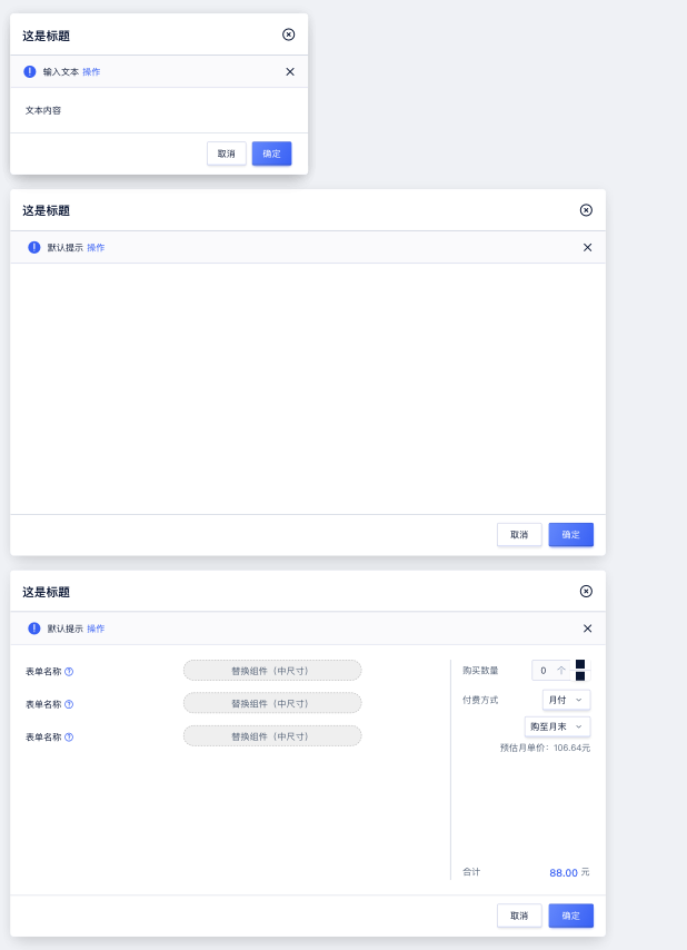
title/footer - 自定义 title/footer 内容
size - 预设尺寸
closable - 关闭按钮
mask - 是否有遮罩层
buttonProps - 自定义按钮属性
maskClosable - 是否可通过点击遮罩层关闭
keyboard - 是否可通过键盘关闭
destroyOnClose - 关闭后是否直接销毁
notice - 弹窗中的提示
自定义 className
自定义样式
popupContainer - 弹出层容器
Content
Props
| Prop Name | Type | Required | Default | Description |
|---|---|---|---|---|
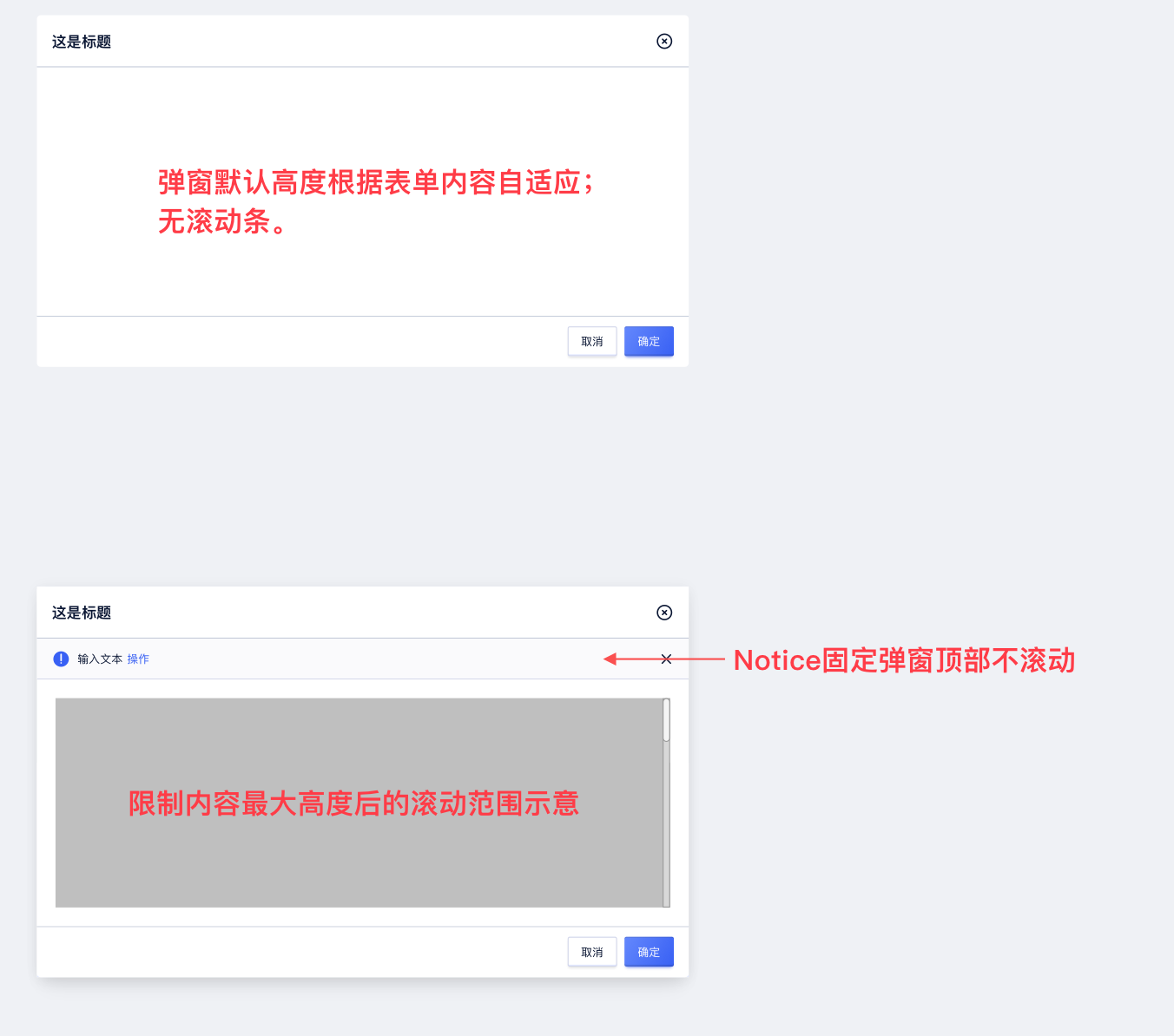
| maxHeight | string | 定义容器最大高度,传入后超过高度会出滚动 |
说明
弹窗内容容器组件,为了方便组合,没有将间距、滚动等内置,而是拆分为自组件