


Tag
Props
| Prop Name | Type | Required | Default | Description |
|---|---|---|---|---|
| styleType | enum | 'default' | 样式风格 | |
| closable | bool | 是否显示关闭按钮 | ||
| onClose | func | 关闭回调 | ||
| icon | union | 自定义前置 icon | ||
| iconSize | enum | 'sm' | icon 大小 | |
| border | bool | true | 是否开启border样式 | |
| borderType | enum | 'default' | border 类型 | |
| suffix | node | 后缀 | ||
| disabled | bool | 是否禁用 | ||
| customStyle | shape | 自定义样式 |
说明
这是 Tag 组件,用作属性标签等标识
演示
功能演示
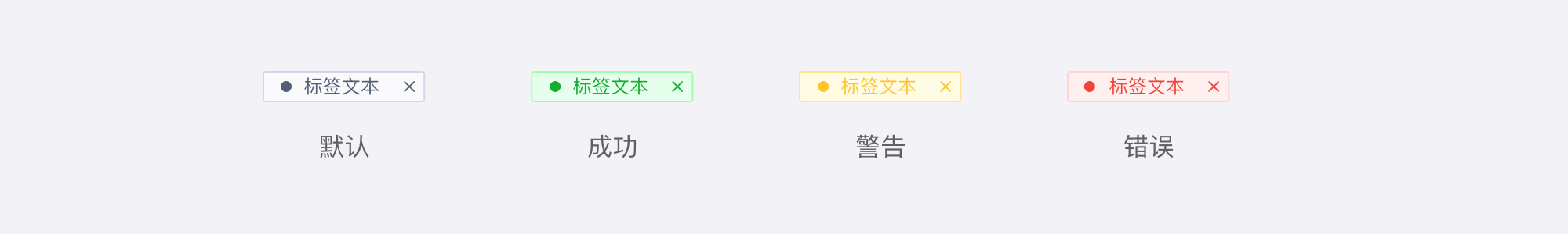
当使用类型为 crisped 的 styleType , closable 将会失效,如果需要请自定义 suffix样式风格 - styleType
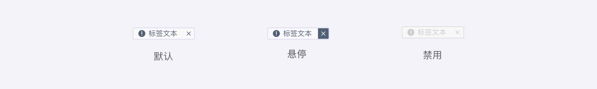
是否可关闭 - closable
是否禁用 - disabled
自定义 icon - icon
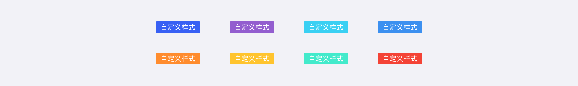
自定义样式 - customStyle
Icon
Props
| Prop Name | Type | Required | Default | Description |
|---|---|---|---|---|
| icon | union | 自定义 icon | ||
| prefix | string | 同 Icon 组件 prefix | ||
| styleType | enum | 样式风格 | ||
| iconSize | enum | 'sm' | icon 大小 | |
| border | bool | true | 是否开启border样式 | |
| borderType | enum | 'default' | border 类型 | |
| customStyle | shape | 自定义样式 |
说明
- 这是只有 Icon 的 Tag 组件,用作纯 Icon 标识
演示
功能演示
样式风格 - styleType
自定义 icon - icon
自定义样式 - customStyle
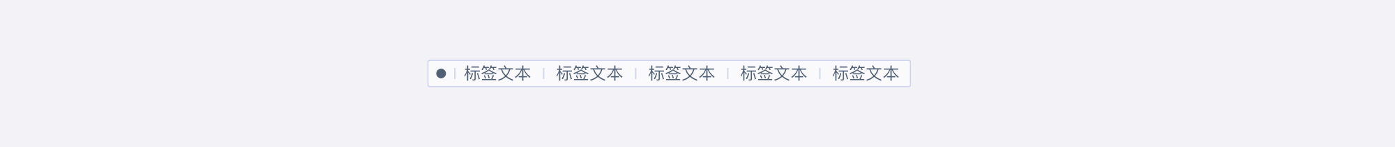
Group
Props
| Prop Name | Type | Required | Default | Description |
|---|---|---|---|---|
| compact | boolean | 紧凑型布局 | ||
| exposeCount | number | 暴露的Tag数量 | ||
| autoAdjustment | boolean | 是否自动按照宽度调整展示数量 | ||
| popoverProps | any | 弹出层的 popover props |
说明
- 这是 Tag 的 Group 组件,用于包裹 Tag,并提供紧凑型布局
演示
- 功能演示
- 紧凑布局 - compact
- 暴露的 Tag 数量 - exposeCount
- 自适应 - autoAdjustment