


Badge
Props
| Prop Name | Type | Required | Default | Description |
|---|---|---|---|---|
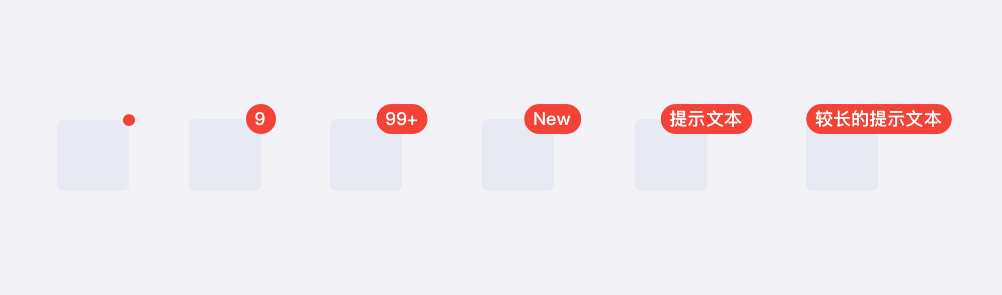
| value | ReactNode | 显示内容 | ||
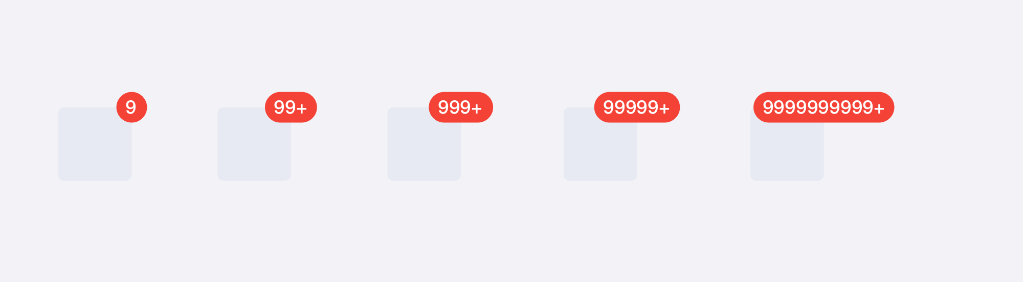
| maxValue | number | 99 | 为数字时能显示的最大值,超过将显示最大值+ | |
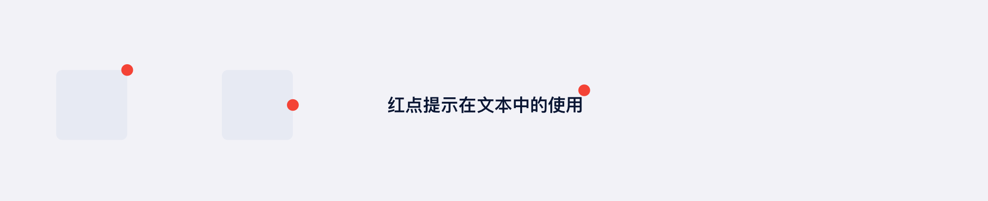
| dot | boolean | 显示为点状 | ||
| placement | 'topRight' | 'topLeft' | 'bottomRight' | 'bottomLeft' | 'top' | 'bottom' | 'left' | 'right' | 'topRight' | badge 的位置 | |
| hideWhenZero | boolean | 为 0 时是否隐藏 | ||
| badgeStyle | CSSProperties | badge的样式 | ||
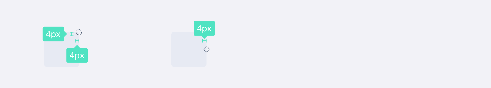
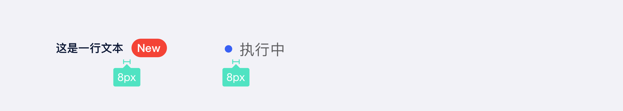
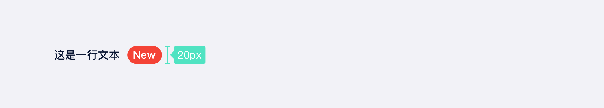
| offset | tuple | 定义 badge 的偏移,第一个参数 x 轴偏移量,第二个值为 y 轴偏移量 | ||
| children | ReactNode | 定位的内容,为空时仅展示 Badge,定位等属性不生效 | ||
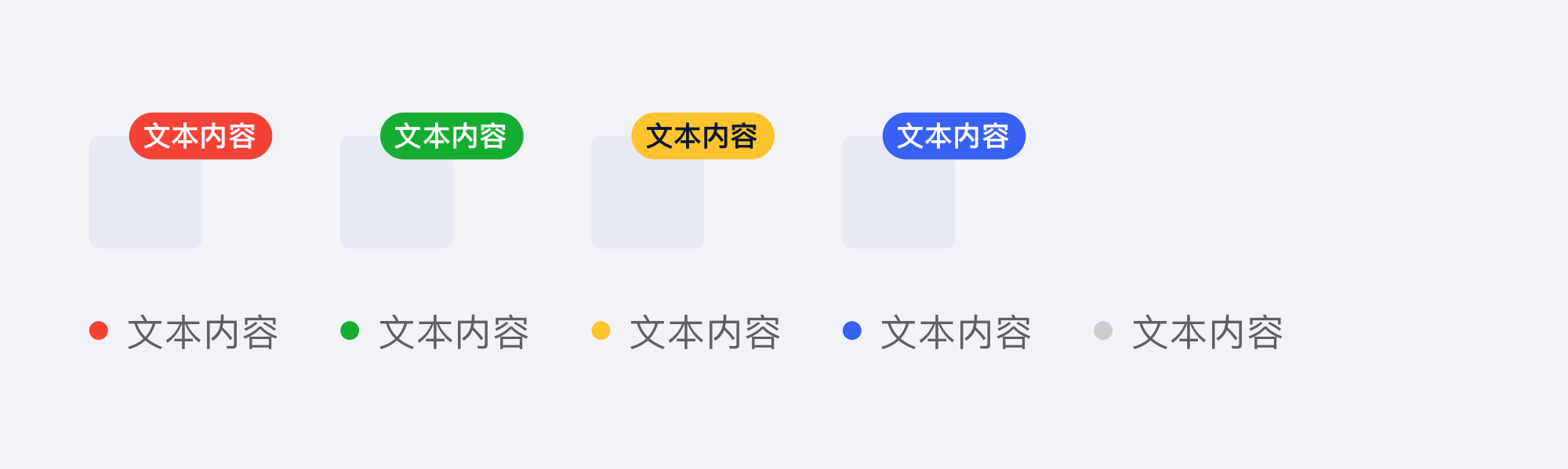
| color | 'red' | 'green' | 'yellow' | 'primary' | 'red' | 选择预设的颜色 | |
| zIndex | number | 9 | badge 的 zIndex |
说明
- 这是 Badge 组件,用作角标展示
- 支持点状角标
- 预设部分颜色和角标位置
- 不传 children 时会将角标单独展示,可用来作标记
- 角标的 zIndex 默认为 9,无 children 时无 zIndex
演示
演示
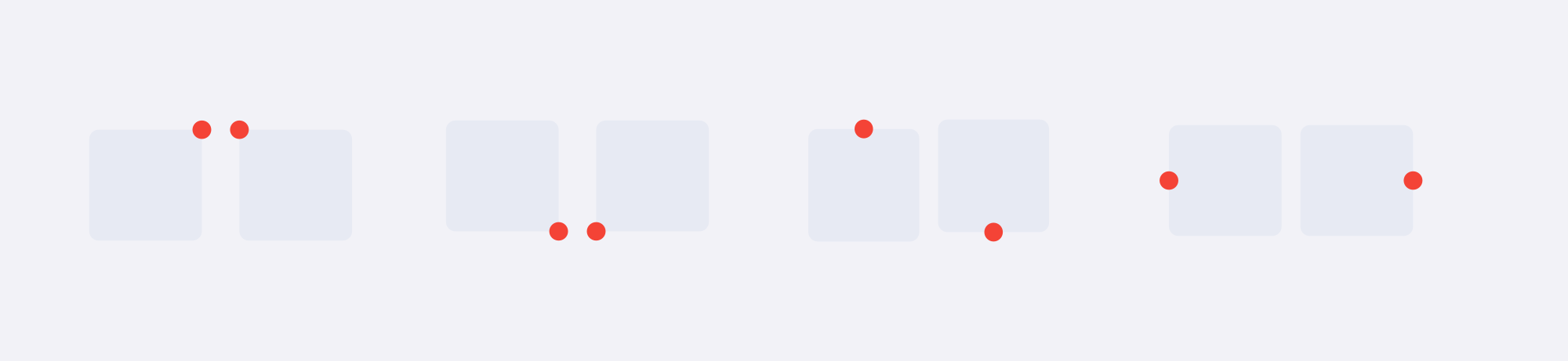
placement - 位置
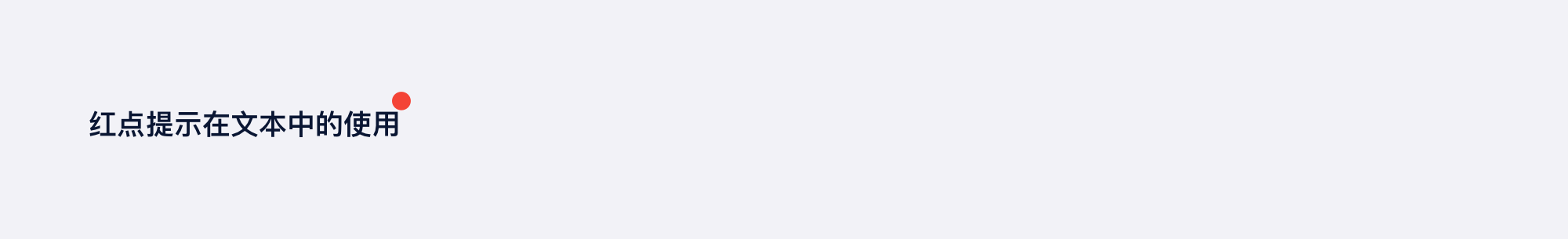
dot - 显示为点
hideWhenZero - 为 0 时自动隐藏
maxValue - 最大值
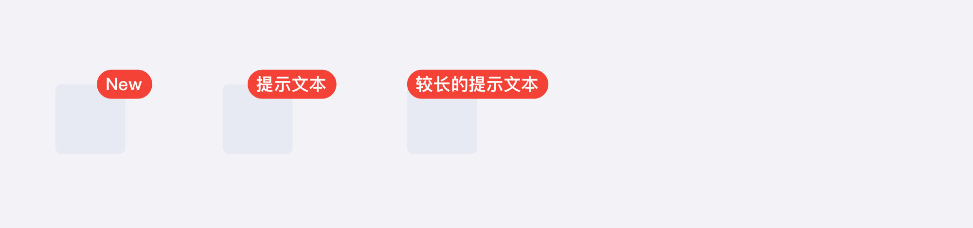
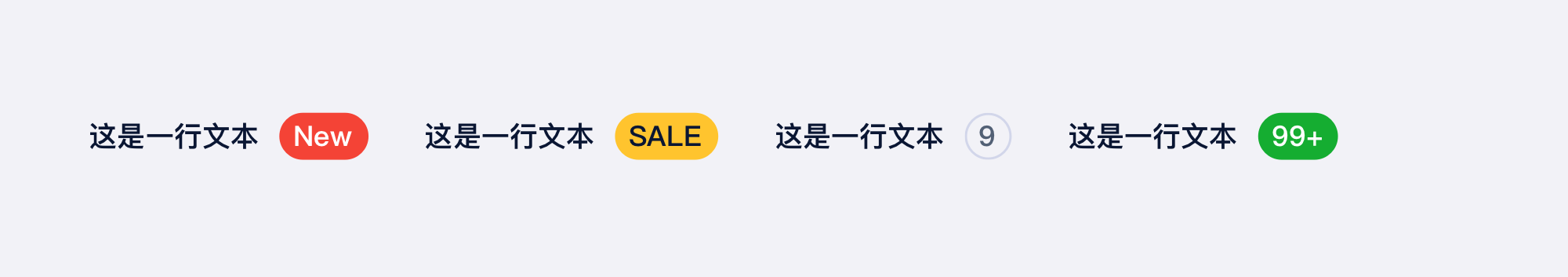
value - 自定义内容
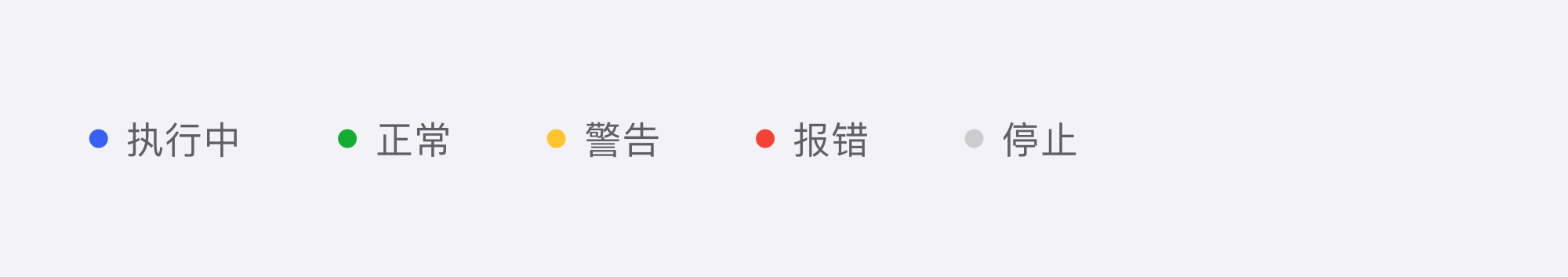
color - 预设颜色
badgeStyle - 自定义样式
无内容时展示
案例展示
Bubble
Props
deprecated : 后续会移除,请使用 Badge 替代
| Prop Name | Type | Required | Default | Description |
|---|---|---|---|---|
| bubble | node | 泡泡内容 | ||
| styleType | enum | required | 内置样式风格 | |
| size | enum | 'md' | 尺寸 | |
| customStyle | shape | 自定义样式 | ||
| offset | array | [12, -4] | 自定义偏移量 |
说明
- 这是 Bubble 组件,特殊的角标样式提示