
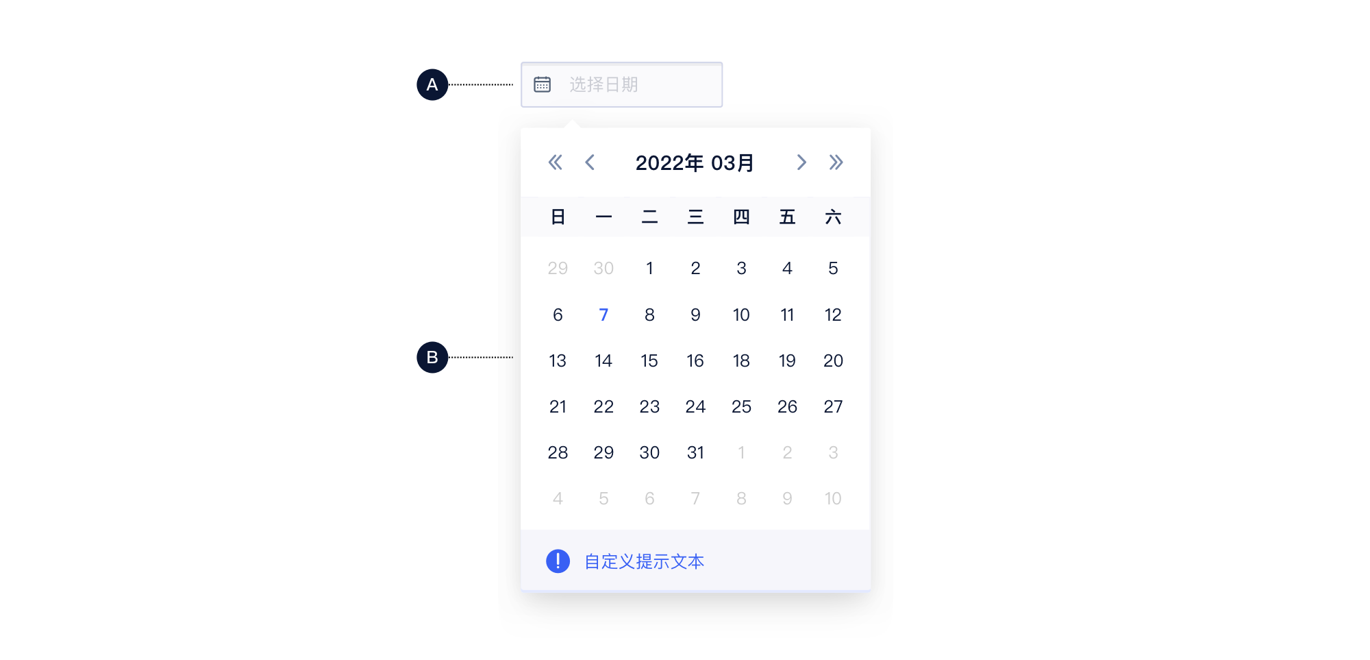
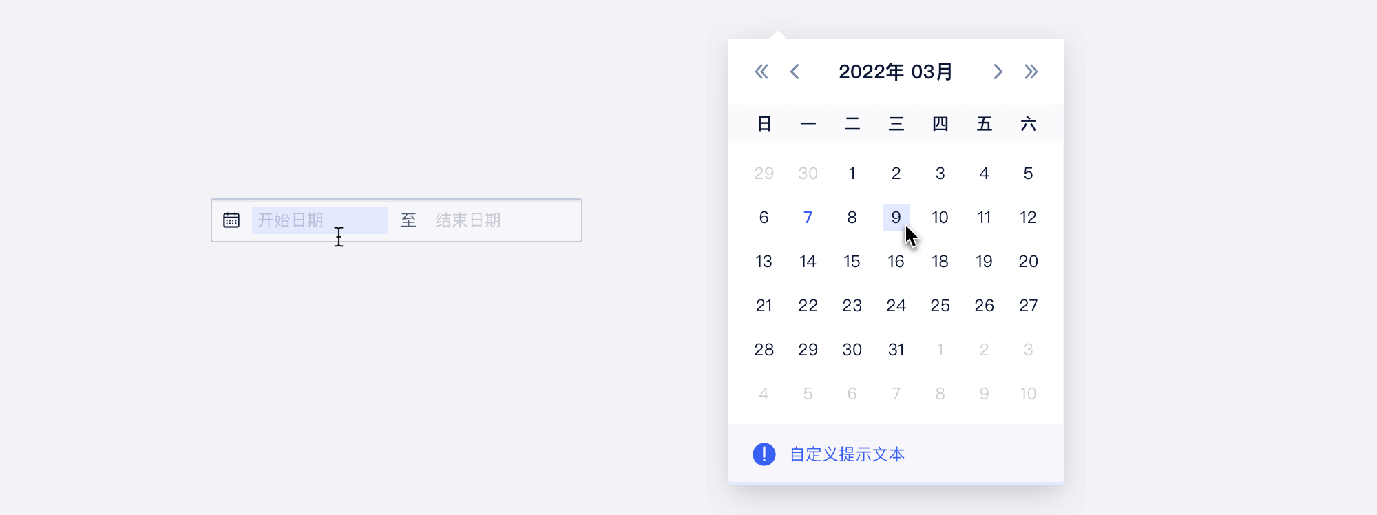
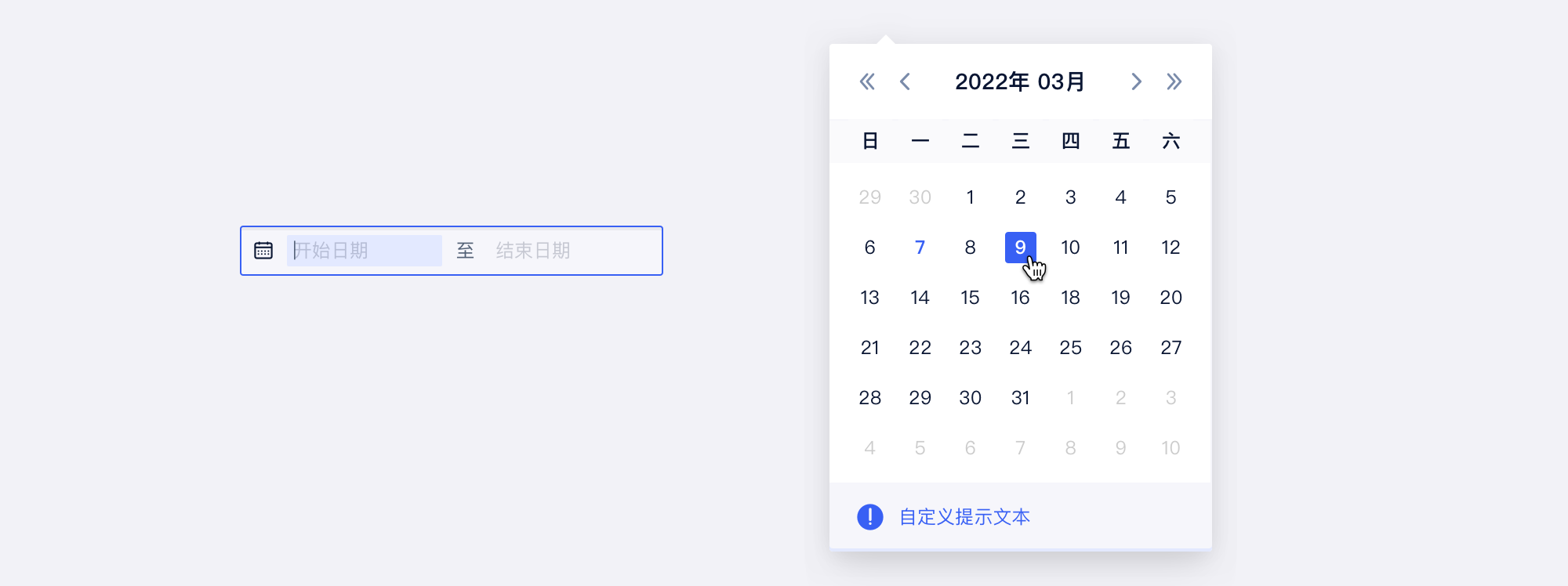

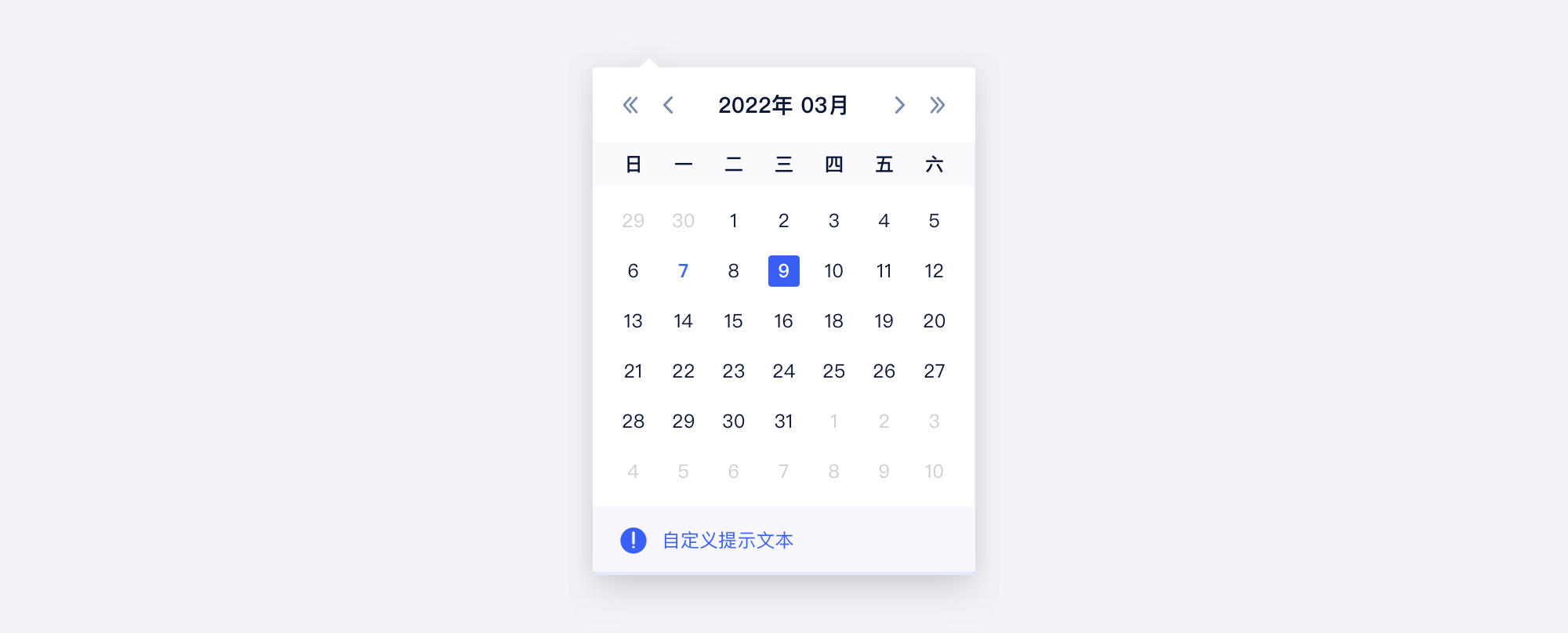
DatePicker
Props
| Prop Name | Type | Required | Default | Description |
|---|---|---|---|---|
| value | TDate | null | 值,受控 | ||
| defaultValue | TDate | null | 默认值,非受控 | ||
| onChange | (v: Moment | null) => void | 修改回调 | ||
| rules | any | 自定义规则 | ||
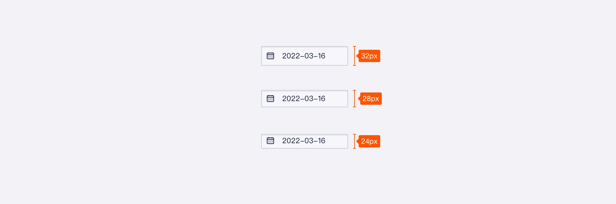
| size | Size | 尺寸 | ||
| format | string | string[] | 输入和展示的字符串格式,为数组时,第一个用作展示,并影响时间面板 | ||
| nullable | boolean | 是否可为空,为空时不传或传入空值会默认为当前时刻 | ||
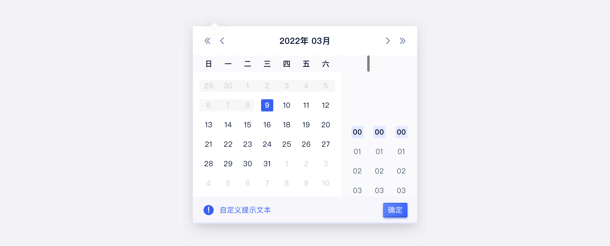
| display | { date?: { /** @deprecated 设置日期展示格式,使用 format 替换 */ format?: string; /** @deprecated 是否展示日期选择,仅时间选择需求使用 TimePicker 替换 */ show?: boolean; }; /** 设置为 false,隐藏时 */ hour?: boolean; /** 设置为 false,隐藏分 */ minute?: boolean; /** 设置为 false,隐藏秒 */ second?: boolean; } | @deprecated 使用 format 替换
设置操作面板,时分秒 | ||
| disabled | boolean | 是否禁用 | ||
| status | 'default' | 'error' | 状态 | ||
| placeholder | string | placeholder | ||
| popoverProps | any | 自定义 popover,参考 popover | ||
| type | 'date' | 'month' | 类型 | ||
| locale | LOCALE | 自定义语言 | ||
| zIndex | number | @deprecated 使用 popoverProps 替换
弹出层的 z-index | ||
| getCalendarContainer | (triggerNode: Element) => Element | @deprecated 使用 popoverProps 替换
弹出层容器,参考 popover.getPopupContainer |
说明
- 这是 日期选择 组件
- 需要自行导入 moment 语言包、设置时区
数据结构
TDate
type TDate = number | Date | Moment | Dayjs;TShortcut
interface TShortcut {
    handle: () => TDate;
    label: ReactNode;
}
演示
演示
size - 尺寸
rules - 自定义规则
nullable - 是否可为空/输入
display - 自定义展示形式
format - 自定义格式化/输入
status - 状态
disabled - 禁用
uncontrolled
popoverProps - 弹出容器定义
月份演示
size - 月份尺寸
rules - 月份自定义规则
nullable - 月份是否可为空/输入
display - 月份自定义展示形式
format - 月份自定义格式化/输入
status - 月份状态
disabled - 月份禁用
uncontrolled - 月份非受控
popoverProps - 月份弹出层容器
Month
Props
说明
请使用 <DatePicker type='month' /> 替换
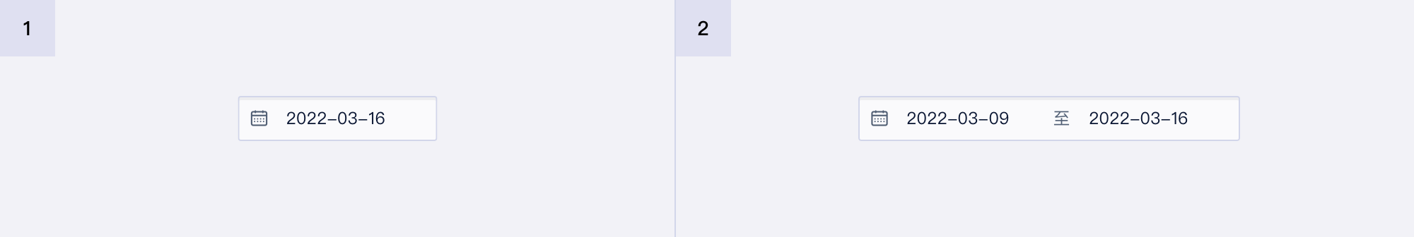
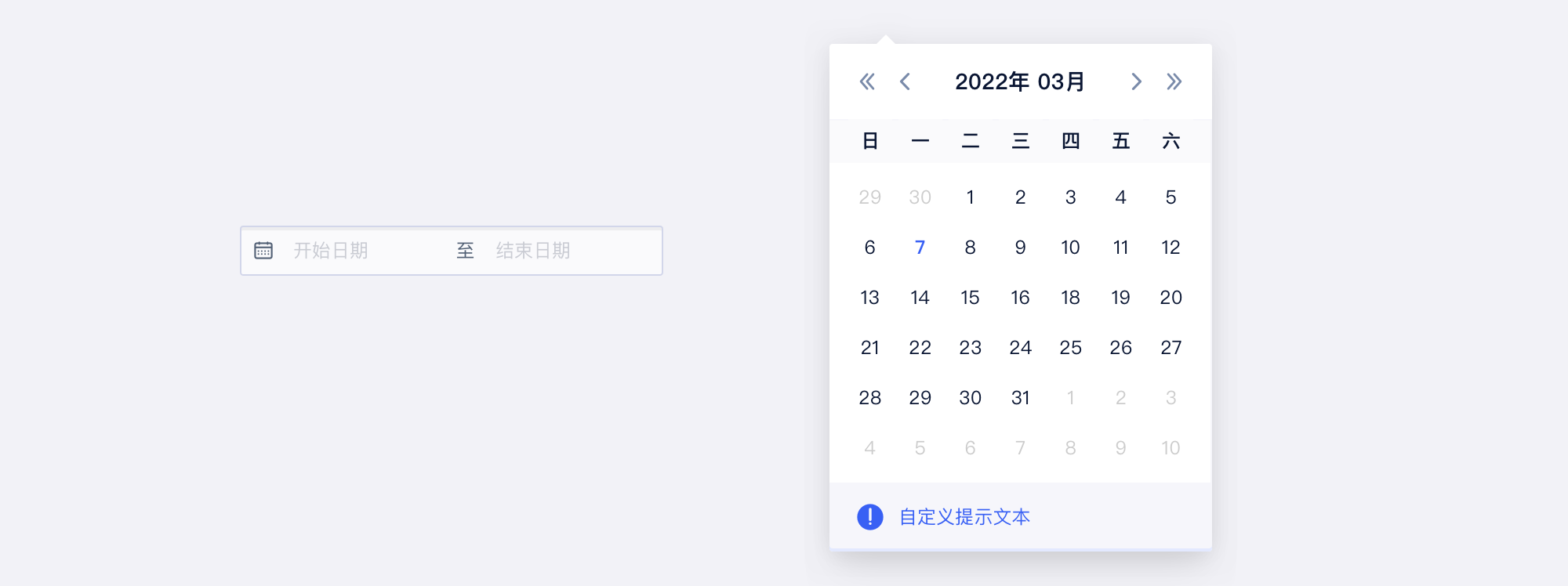
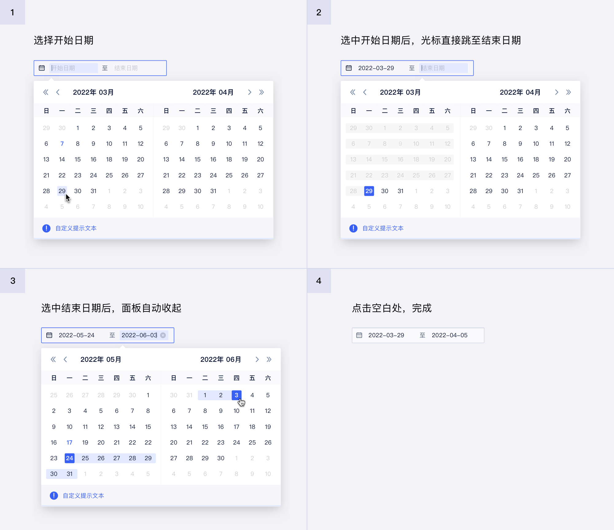
Range
Props
| Prop Name | Type | Required | Default | Description |
|---|---|---|---|---|
| value | tuple | 当前值,受控 | ||
| defaultValue | tuple | 默认值,非受控 | ||
| onChange | (v: [Moment | null, Moment | null]) => void | 修改回调,返回 moment 对象数组 | ||
| onInitialChange | (v: [Moment | null, Moment | null]) => void | 初始化回调函数,传入 option 的情况下会输出 option 对应的值,配合 option 或者 defaultOption 使用 | ||
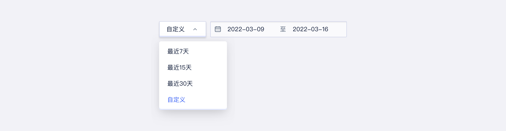
| options | { label: ReactNode; value: string; disabled?: boolean; range?: { start?: TDate; end?: TDate; }; }[] | 选项 | ||
| option | string | 当前选项,受控 | ||
| defaultOption | string | 默认选项,非受控 | ||
| onOptionChange | (option: string) => void | 选项变化回调 | ||
| hideOptions | boolean | @deprecated 不传入 options 即可隐藏
隐藏快捷选项 | ||
| nullable | [boolean | undefined, boolean | undefined] | [boolean | undefined] | [] | 是否可为空 | ||
| format | string | string[] | 输入和展示的字符串格式,为数组时,第一个用作展示 | ||
| display | { date?: { /** @deprecated 设置日期展示格式,使用 format 替换 */ format?: string; /** @deprecated 是否展示日期选择,仅时间选择需求使用 TimePicker 替换 */ show?: boolean; }; /** 设置为 false,隐藏时 */ hour?: boolean; /** 设置为 false,隐藏分 */ minute?: boolean; /** 设置为 false,隐藏秒 */ second?: boolean; range?: { /** @deprecated 新版无用 */ format?: string; }; } | {} | @deprecated 使用 format 替换
展示格式,会传入 DatePicker 和 Month 中(按照 type) | |
| rules | { range?: [TDate | void, TDate | void]; maxRange?: any; minRange?: any; } | {} | 自定义规则 | |
| status | 'default' | 'error' | 状态 | ||
| placeholder | [string | undefined, string | undefined] | [string | undefined] | [] | placeholder | ||
| type | 'date' | 'month' | 'date' | picker 类型 | |
| shortcuts | [TShortcut[] | null, TShortcut[] | null] | [TShortcut[] | null] | 面板快捷内容 | ||
| size | 'sm' | 'md' | 'lg' | 'md' | 控件尺寸 | |
| disabled | boolean | 是否禁用 | ||
| zIndex | number | 弹出层的 z-index | ||
| selectProps | any | 自定义默认选项 props | ||
| popoverProps | any | 自定义时间选择框弹出层props | ||
| customRender | { /** 自定义渲染只读时(非自定义选项)的展示内容(时间区域) */ readonlyDisplay?: (value: [TDate | null, TDate | null]) => ReactNode; } | 自定义渲染 | ||
| rangeTip | ReactNode | 提示信息,展示在时间选择弹窗中 |
说明
这是时间范围选择组件